Wiltshire Psychology
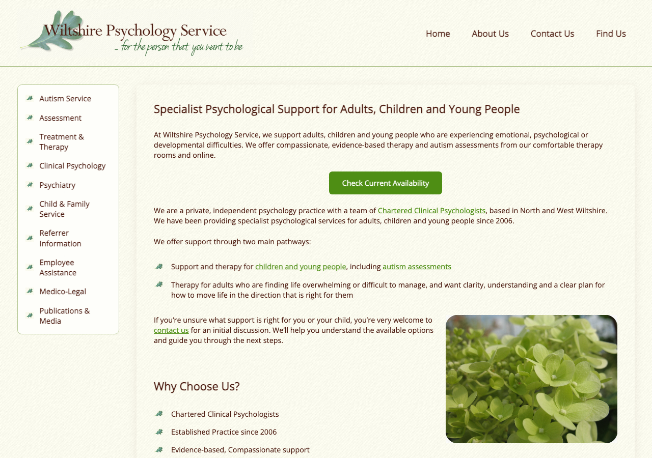
A careful mobile-responsive retrofit of a 20-year-old psychology practice website. The priority was mobile usability and SEO preservation. Not a rebuild, not a rewrite. Just the right work, done thoughtfully.
~£500
Under Budget
20 yrs
Original Site Age
Early
Delivered Ahead of Schedule
0%
Drop in Organic Search
Overview
The Problem
The Wiltshire Psychology Service have been trading for over 20 years. Their website, built in PHP with a hand-crafted CSS stylesheet, had served them well and ranked solidly in search. But on a phone, the site was a mess: text spilled off-screen, navigation was almost unusable, and pages were a struggle to read without pinch-zooming.
The impact was measurable. Enquiries for their Autism Assessments service had declined noticeably, and Google Search Console pointed clearly at mobile usability as the cause. Most users now arrive on a phone, and the site was letting them down the moment they landed.
The challenge was to fix all of this without disrupting anything that was working. The existing URLs, page structure, SEO performance, and content all had to stay exactly as they were. No CMS migration. No framework swap. Same hosting, same database, same files. Just a better experience for visitors.
The Solution
A thoughtful retrofit. Not a rebuild. Not a redesign. Every URL, heading, and piece of content stayed in place. I worked from a local staging copy and the live site was never touched until the client had approved everything.
The focus was mobile: a proper hamburger navigation, fully responsive layouts, readable text without zooming, and consistent rendering across Android and iOS. Along the way I standardised the typography, fixed a handful of long-standing layout bugs, and repaired broken external links that had quietly gone bad over the years.
The client was closely involved throughout, testing on multiple real devices and feeding back, with decisions made collaboratively. When one font did not feel right, I added a live font-switching tool so the client could trial options directly in the browser. The finished site went live on their existing hosting with no changes to the server configuration or database.
Before & After
The Same Site. A Different Experience.
Same URLs, same content, same hosting. The only thing that changed was how it looked and worked on every device.
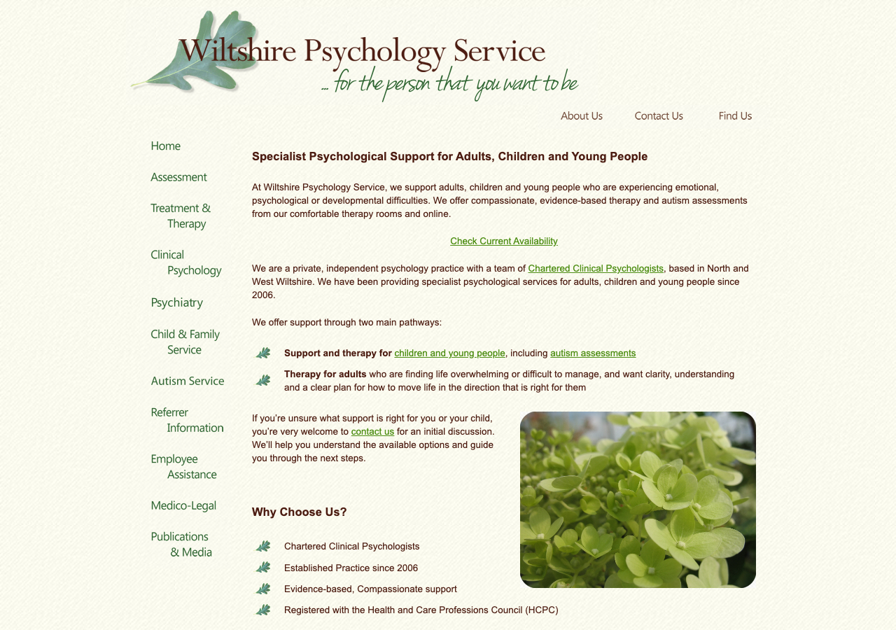
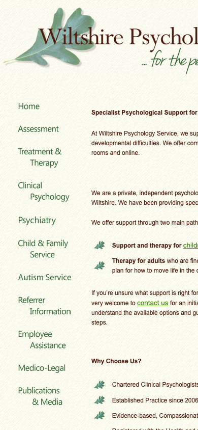
- Fixed-width layout, only usable on a large monitor.
- On mobile, text spilled off-screen and the sidebar squashed the body copy.
- No hamburger menu. Visitors had to pinch-zoom just to read.
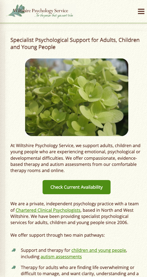
- Fluid, fully responsive layout with sticky top navigation.
- Mobile pages fully readable without zooming on every tested device.
- Hamburger menu working cleanly across Android and iOS.
The Work
What Was Done
Mobile Responsiveness
Every page retrofitted to work correctly on phones and tablets. No horizontal scrolling, no text overflow, no pinch-zooming. Tested across Android and iOS on multiple real devices.
Improved Navigation
Hamburger menu on mobile. Sticky desktop header. Active page highlighted. Autism Assessments raised to the top of the menu to improve visibility of the practice's most-searched service.
Typography Refinement
Built a live font-switching tool so the client could trial typefaces directly in the browser. Settled on Open Sans Regular. Standardised heading sizes across every page for consistency and SEO correctness.
Bug Fixes
Repaired broken external links that had quietly gone bad over the years. Fixed expanding sections on the Autism page, text sizing on the Assessment page, and a misbehaving "Check Availability" scroll target.
Visual Restoration
Restored Contact page postal address indentation and image alignment. Repositioned the flower image on the Home page for a better first impression.
Staging & Sign-off
All work carried out on a local staging environment, with the client reviewing changes on a preview URL. The live site was never touched until full client approval.
Screenshots
The Site in Detail
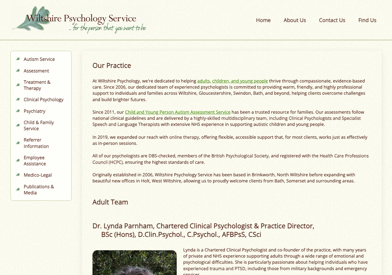
The About page. Standardised heading sizes and refined typography throughout for a cleaner, more consistent read.
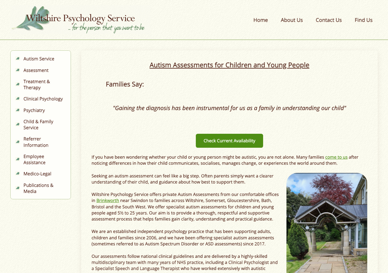
The Autism Assessments page, given higher prominence in the navigation and fully accessible on mobile for the first time.
Approach
The Right Work, Done the Right Way
Listen first
The client came with a clear brief: improve mobile usability without disrupting what already worked. I produced two working mockups upfront, a careful retrofit and a more radical redesign, so they could see both directions and make an informed choice. They chose the retrofit. That was the right call.
Never upsell
The client spoke to other developers before reaching out. Others pushed for a complete rewrite. I did not, because a rewrite was not what the site needed. A 20-year-old site that ranks well is an asset. Unnecessary work is just risk and cost.
Staging, always
Every change was made on a local copy of the site. The client reviewed and approved a preview URL before a single file was changed on the live server. When issues were found, they were fixed in staging, not in production under pressure.
Tech Stack
No Framework. No Migration. No Risk.
The existing site was PHP with hand-written HTML and CSS. I worked within that stack, with no new dependencies, no framework imports, and nothing that could break the client's ability to edit pages themselves. The database was not touched.
Existing Stack (Retained)
What Changed
Client Testimonial
In Their Own Words
We approached Roger to retrofit and modernise our long-established website while carefully preserving the elements that were important to us. From the outset, he listened closely to what we wanted to achieve, understood the reasoning behind our approach, and respected the fact that we were looking for a thoughtful upgrade rather than a complete replacement.
Roger quickly produced mock-ups showing how the proposed changes would work in practice, which gave us confidence moving forward. Unlike some other companies we spoke to, he never tried to upsell unnecessary features or push us towards solutions we did not want. Instead, he worked collaboratively with us throughout the project, offering sensible suggestions where appropriate and responding quickly and thoughtfully to queries and feedback.
The work was completed faster than estimated, stayed within budget, and the finished website now looks and functions significantly better, particularly on mobile phones, which was our main objective from the beginning.
Roger was an absolute pleasure to work with throughout the process, and we would not hesitate to commission further work from him in the future.
Chris
On behalf of Dr Lynda Parnham, Wiltshire Psychology Service
Why Work With Me
I fix what needs fixing. I do not invent problems to sell you solutions.
The Wiltshire Psychology Service had a 20-year-old website that ranked well and served its purpose, just not on mobile. Other developers told them they needed a complete rewrite. I told them they did not. A retrofit was the right call, and that is what we delivered.
That is how I work. I look at the problem, not the budget. I do the work that is actually needed. And when a client has clear priorities, in this case mobile usability above everything else, I keep my focus there instead of chasing scope.
The result speaks for itself: delivered ahead of schedule, within budget, with zero disruption to SEO, zero changes to hosting, and a client who says he would commission further work without hesitation.
What my clients get
- An honest assessment of what actually needs doing
- Work done in staging, with the live site never touched without approval
- Fast turnaround with clear communication throughout
- No upselling, no unnecessary features, no inflated scope
- A fixed price ceiling agreed before work begins
- Full documentation of everything done and why
- 25+ years working with legacy PHP and older websites
Portfolio
More recent work
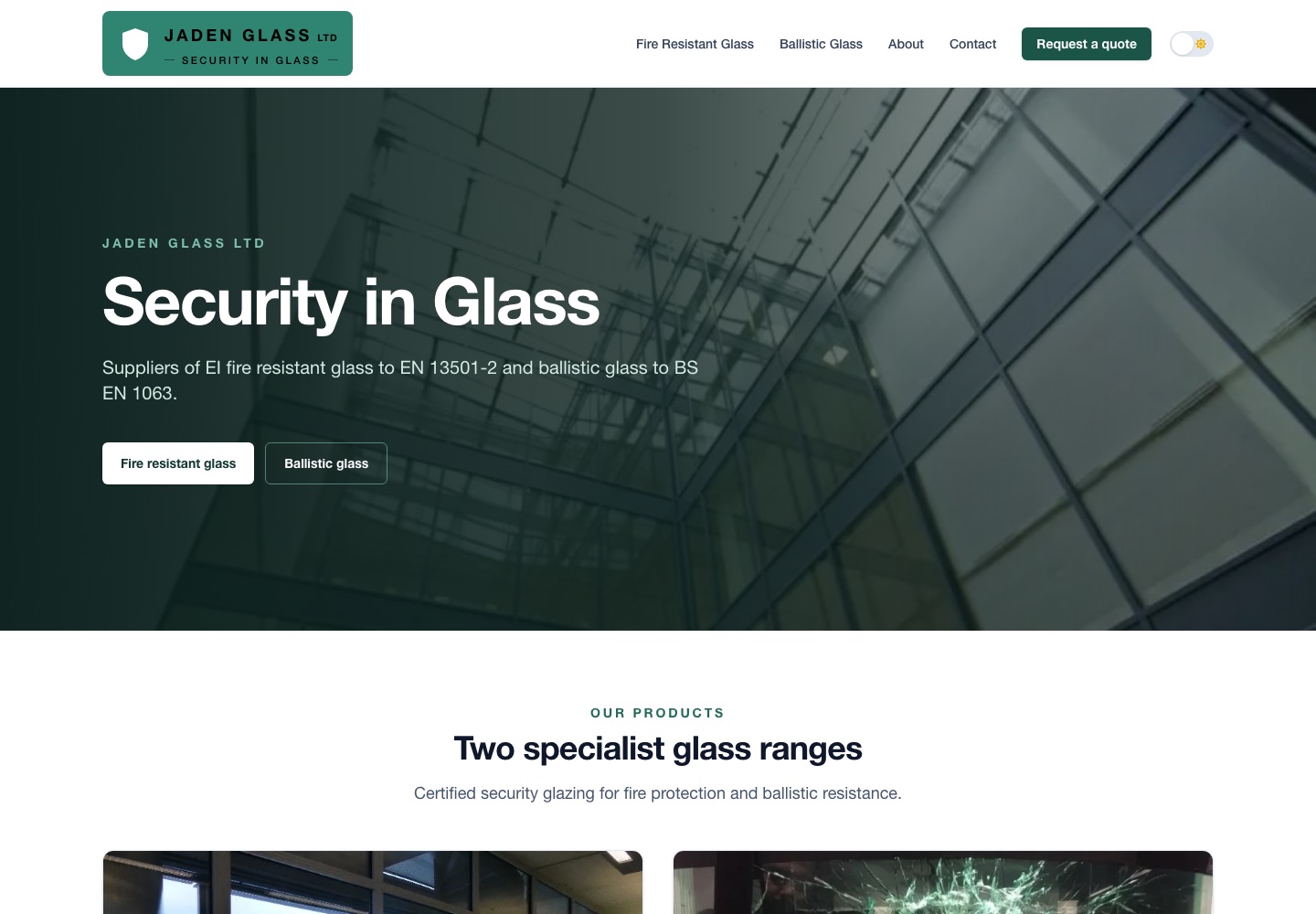
JadenGlass.com
A first website for a new supplier of fire resistant and ballistic glass. Two product sheets turned into certified-spec tables, a ballistic protection ladder and a logo, signed off in four weeks.
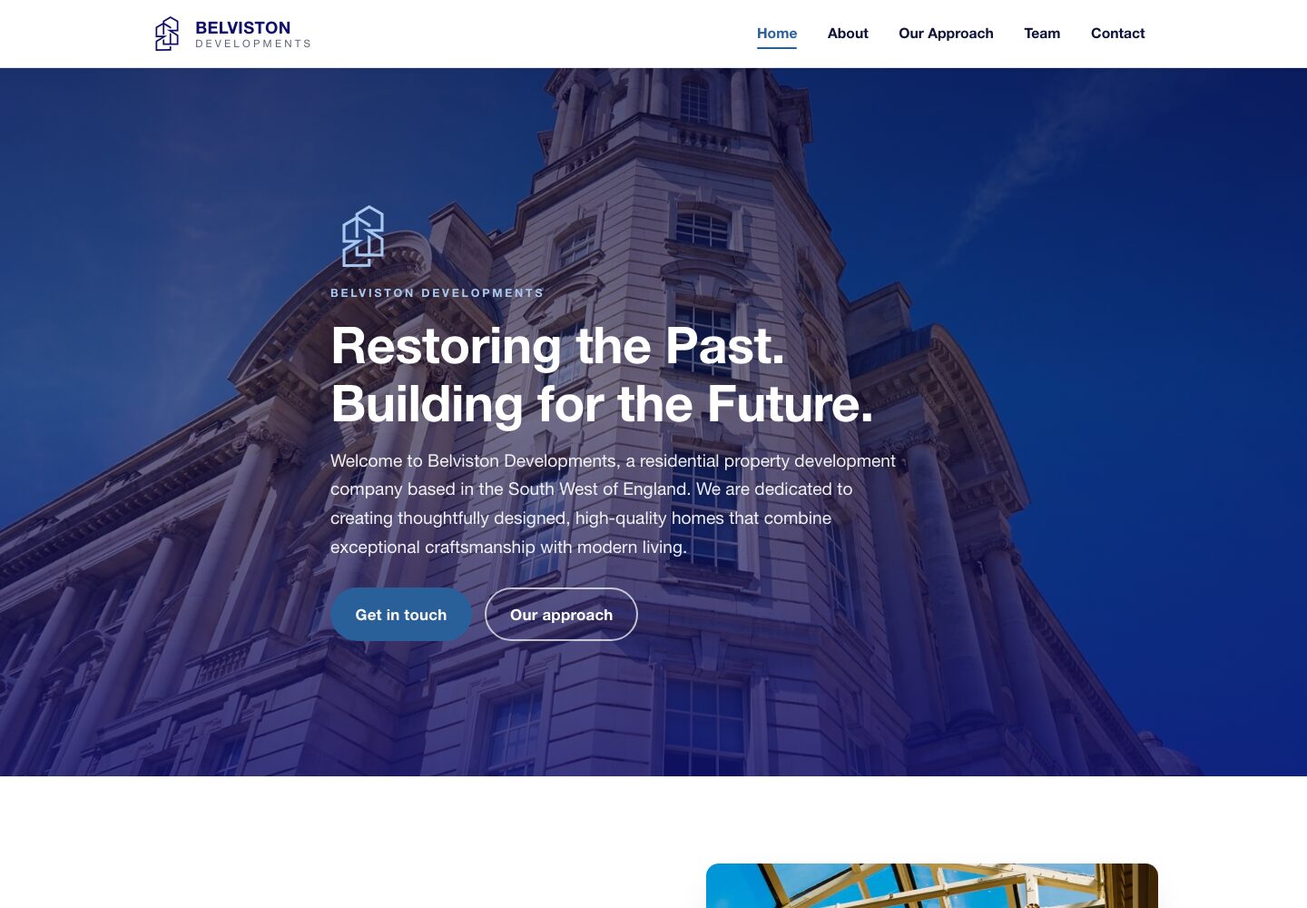
Belviston.co.uk
A property developer stuck with a hosting company's website builder. Two design directions to choose from, and a bespoke site she owns outright, live inside a week.
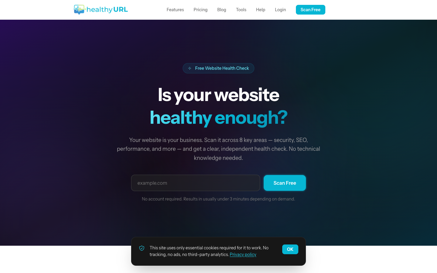
HealthyURL.co.uk
An AI-powered website audit platform. Scan any site across 8 categories, get AI-generated fix guides, and track repairs over time.
Got an older site that needs the same treatment?
I work with legacy PHP sites regularly. Let's talk about what yours needs.
The information in this case study was accurate at the time the site launched. The owner may have changed features, prices or other details since, and any such changes are not reflected here.